Amazon Got Fined. Then Made the UX Worse.
The FTC first filed its case against Amazon in June 2023, targeting deceptive UX patterns that obscured Prime enrollment and made cancellation deliberately difficult. By September 2025, the case resulted in a $25 million fine and a public refund announcement.
Recently, Amazon quietly rolled out some interface changes.
Here's a look at what's new, and what's still a problem.
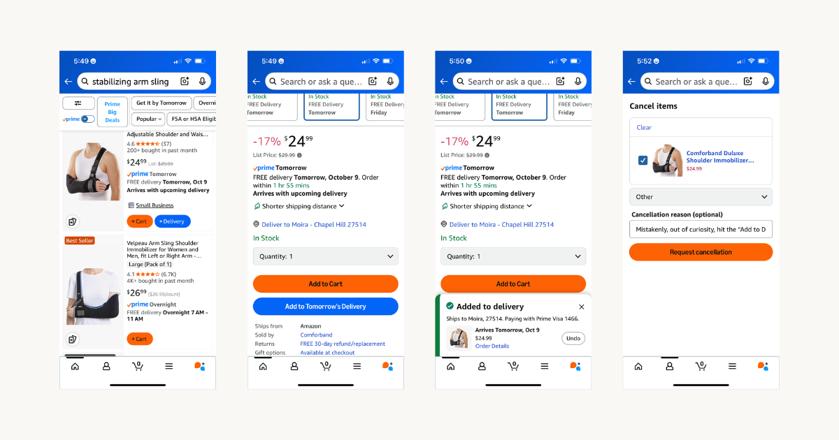
In the product list view, Amazon has introduced two parallel buttons:
+ Cart (orange)
+ Delivery (blue)
It might look like a step forward: a bit more contrast, slightly clearer labels, a cleaner layout.
But it’s a structural patch, not a meaningful change. It still puts the burden of clarity on the user.
What remains unclear
“Delivery” is ambiguous.
Is it recurring shipping? A pre-scheduled merge with another order? A “Buy Now” replacement? The copy in the middle of the product card (“Arrives with upcoming delivery”) tries to explain it, but it’s too visually and cognitively disconnected from the button itself.
Color isn’t enough, especially for accessibility.
The orange and blue buttons may look distinct to sighted users, but for colorblind users or anyone with low contrast sensitivity, the difference is murky. The contrast ratio between the two hues may still fall short of WCAG standards (especially on mobile, where ambient lighting plays a big role). Visual distinction without semantic clarity doesn’t go far enough.
Touch targets are still tight.
In the product list view, the buttons are side-by-side, with minimal padding. This is an issue for one-handed users, anyone with dexterity challenges, or, say, someone shopping with a non-dominant hand while injured. Accidental taps feel inevitable.
Now, we'll give credit where it’s due.
On the product detail page, things improve slightly:
- Button labels are now more differentiated: “Add to Cart” vs. “Add to Delivery”
- There’s a bit more spacing, which helps reduce accidental taps
- They’ve removed the “Buy Now” button in some cases
Notoriously, the “Buy Now” button—styled similarly to “Add to Cart”—was a trap. I’ve accidentally triggered purchases simply due to color proximity and unclear affordance. Canceling those orders was its own user journey.
“Buy Now” still appears in certain conditions, like when “Add to Delivery” isn’t available. So now we have (conservatively) three purchase paths with inconsistent behavior and visual logic across them.
Design after the fine
In the wake of the FTC’s settlement, there’s a sharper lens on every interface choice Amazon makes.
These weren’t abstract violations. They were strategy made visible through design.
And this new button pattern? It feels like more of the same: performing compliance without actually meeting the user’s mental model.
I went back to the same product to test the “Add to Delivery” button. I expected some sort of confirmation modal. Instead, tapping the button immediately charged my credit card and scheduled the item for delivery the next day, with no additional review step. A toast briefly appeared with an “Undo” link, but it disappeared within seconds.
To reverse the order, I had to go through Amazon’s full cancellation flow—multi-step, friction-filled, and requiring a cancellation reason before I could opt out.
These design choices trade user comprehension for legal defensibility. Amazon is saying, in effect: “We gave you more buttons. What more do you want?”
This is UX engineered to appear compliant, while still obscuring function, exploiting defaults, and shifting the burden of understanding onto the user.
When design is this unclear, it’s not neutral. It’s strategic.
Want more real-world UX breakdowns like this?
Subscribe to Mosaic Dispatch for weekly notes on design, systems, and the patterns that shape how we live and build.